
看似簡單,實則最難的空間色彩規劃 Color Planning: The Simplest Ratios are the Hardest to Master
- Darrell Tseng
- Dec 25, 2025
- 3 min read

走進一間屋子,最先擁抱你的往往不是家具的質感,而是空氣中流動的「顏色」。在室內設計中,色彩始終是影響最大,也是最具挑戰的存在。 很多人以為,色彩規劃就是選出自己喜歡的顏色。但真正著手後才發現,要把心儀的顏色揉合在一起而不顯雜亂,其實是一場關於「平衡」的修行。「空間色彩規劃,看似最簡單,實則最難。」 難在我們總是想要得太多,卻忘了留白的美感。
要在這份困難中找到出口,設計界有一個被驗證無數次的經典法則:60-30-10 + B/W。
這不只是設計公式,更是一套生活哲理:
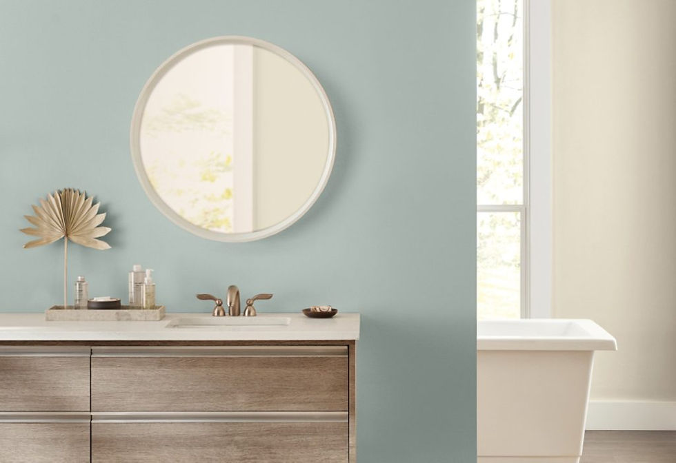
60% 的主色(Base Color): 這是空間的基調,通常落在牆面與地板。它像是一個人的性格底色,建議選擇溫潤、低飽和的色彩。這 60% 的平淡,是為了讓心靈有地方安放,如同生活中那些規律而穩定的日常。
30% 的輔助色(Secondary Color): 出現在沙發、地毯或大型收納櫃。它賦予空間靈魂,讓基調不再單調。這 30% 是生活中的熱情與轉折,是我們對外的姿態。
10% 的強調色(Accent Color): 僅需一盞燈、一個抱枕或一幅畫。這 10% 是最純粹的自我,是那些靈光乍現的瞬間,雖然比例最少,卻最是畫龍點睛。
最後,是不可或缺的 B/W(黑與白)。黑色代表穩定與深度,白色代表呼吸與光影。無論你選擇什麼色系,加入一點點黑與白,就像在混亂的思緒中畫下句點與空格,能瞬間讓空間質感提升,顯得沉穩而有層次。
生活也是如此。我們不必每天都過得驚天動魄,大部分的時間是平淡的 60%,偶爾有 30% 的努力,最後那 10% 的驚喜,才顯得彌足珍貴。掌握了這份「簡單」的比例,你就能在複雜的世界裡,調配出最自在的居家溫度。
When you step into a room, the first thing that hits you—evoking a sense of calm or a hint of tension—isn't usually the price tag of the furniture, but the colors dancing on the walls. In interior design, color remains the most influential yet challenging element. It is a silent language that whispers the personality of the inhabitant.
Many homeowners fall into the trap of "choice paralysis," torn between the elegance of muted tones and the energy of vibrant hues. However, life isn't about stuffing everything you love into one box. Much like a healthy relationship, a beautiful home requires layers and "breathing room."
This is where the time-tested 60-30-10 Rule comes in:
60% Base Color: This is the backdrop of your life, usually applied to walls, floors, or large rugs. It acts like the ambient soundtrack of a movie—steady and soothing.
30% Secondary Color: This is found in larger furniture, curtains, or upholstery. It gives the space soul, ensuring the base color doesn't feel monotonous.
10% Accent Color: This is where your personality shines. It could be a bright yellow pillow, an abstract painting, or a lush green plant. Though small in proportion, it is the focal point that catches the eye.
Finally, we add the secret ingredients: B/W (Black & White). Black provides depth and grounding, while white offers light and air. Incorporating touches of black and white into any palette acts like a visual filter, instantly bringing balance to a chaotic room.
Life follows a similar rhythm. We don’t need every moment to be a grand spectacle. Most of life is the steady 60%, complemented by 30% of effort and transition. It’s that final 10% of unexpected joy that makes everything worthwhile. By mastering these proportions, you can transform your home into a sanctuary that reflects your truest self.


Comments